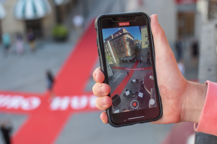
- A huge red cross was placed on the ground, representing the cross of Saint George (patron saint of Aragon), and it brought colour to the city centre, steering people towards the nearby official club shop.
- In holding this kind of promotion, SD Huesca wanted to involve fans in the launch of the new kit and to create buzz.
- The objective was to reconnect with the fanbase and with people from Huesca in an emotional sense and to spark enthusiasm and pride.
SD Huesca have presented their second kit for this season and they’ve done so in a very original and creative way. Ahead of the launch of the new shirt, a huge red cross - the cross of Saint George, patron saint of Aragon - appeared on the ground in the city centre, along with the words ‘Pure Huesca’, with this having been designed by the club for the presentation of the kit. The scene generated great excitement in the city, as this is a very special symbol for the fans and one that the club hope can reactivate the enthusiasm and pride of the supporters.
At the club, they were aware that this occasion deserved special treatment. “This is the shirt design that is most loved by our fans, the most desired, and, after two seasons, we wanted to involve the city in its relaunch,” they explained. This was certainly an unprecedented kind of event, with SD Huesca asserting that “never had a similar action been carried out in the city centre”.
On the day of the presentation, a red cross appeared on the ground at the 'Cuatro Esquinas' crossroads in the city of Huesca, where the Coso Alto, Coso Bajo, Villahermosa and Porches de Galicia streets meet. On social media, the club published the message ‘The wait is over’ and shared a photo of the cross, which led to the club store, with the kits then officially presented a few hours later. As the club explained: “The response from people was incredible. People are happy with the return of the design, and the cross we put up in the middle of the city centre became an attraction for selfies and photos. It was the most popular place in the city during the weekend of the presentation.”
The kit is predominantly white and the cross, logically, stands out. It occupies the entire front of the shirt, made up of two different shades of red, with one of them fading towards a blue colour in the lower part of the shirt, coinciding with the tone chosen for the badge. It also has red stripes at the edge of the sleeves, down the sides and at the back of the collar. Furthermore, it has the inscription ‘Urbs Victrix Osca’, a Latin phrase that appears on the city's coat of arms and which translates as ‘The Victorious City of Huesca’.
The main objective of this campaign was to revive the supporters’ enthusiasm and pride after what was a difficult season in sporting terms. As the club explained: “Our fans were disillusioned and we noticed a significant degree of disaffection. We got the message and worked to reverse the situation, because our fans are the club's greatest asset and we can't let them down.”
It should also be stressed that the campaign was consistent with the club’s outlook in terms of who its target audience is. “One of the values of SD Huesca is that we represent not only a city but a whole province,” the club said. “Thanks to this initiative, there may now be some people who want to know more about us, about the club and about the province. The province is very important to us.” In this way, SD Huesca have reinforced the club’s brand image and the emotional bond with its fans.
