Loading...

WED 16 JUN 2021 | GLOBAL GROWTH
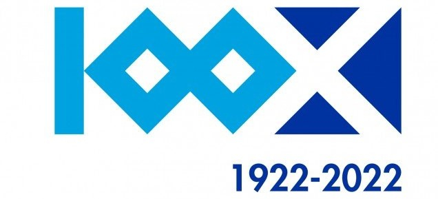
CD Tenerife’s centenary logo: A look to the future while respecting the club’s history
- The island club reviewed more than 25 designs before selecting the logo that will mark its centenary year of 2022.
- The winning design offers vision for the future of the club while incorporating iconic parts of the island such as Mount Teide.
The club badge is a centrepiece of any football club’s brand identity, driving international marketing and merchandising strategies. However occasionally, there are moments that call for a different visual identity to be created. The centenary year of CD Tenerife is one example.
As the island club prepares for the 2021/22 season, in which it will celebrate its 100th year, a newly-created internal team has chosen a new logo that commemorates key aspects of the club’s unique history, while offering a bold new design that can be used to drive new commercial growth and awareness.
A unique identity
Explaining the importance of celebrating its milestone, the club said: “A centenary is a unique and exceptional event, one which brings a great responsibility to all who form part of the organisation. It requires its own identity that brings together the tradition of all these years of history, while also looking to the future.”
To fulfil this promise, the club has formed a centenary management committee, which is made up of members of staff from various club departments, and partnered with DI-CA, the Canary Islands’ Association of Design Professionals and Businesses. “In this way, we made sure that there would be a clear and responsible process with the professionals of this sector, while giving the process the seriousness it deserved,” the club added.
What the logo conveys and its main characteristics
The contest was won by Waldemar Lemanczyk Paz for a design that offered a bold new vision that other centenary logos had not followed. One of the characteristics of the logo, which is made up by a graphic ecosystem of polygons, is its versatility and the fact it can be adapted for different mediums and materials.
“It took around a month of work to design the proposal, as a lot of effort goes into it,” Lemanczyk said. “You continually shape the design, doing so with new formats and digital applications. You have to find solutions. I wanted to avoid circular shapes and elements that I had already seen at other clubs. I wanted to create something different.”
Discussing the branding element of the centenary logo, the club added: “The chosen logo brings together the traditional elements we were looking for along with a vision of the future. This is present in various components that make up the logo, such as the 100, the Tenerife flag or various microelements of the flag like Mount Teide. It’s a complete ecosystem.”
The CD Tenerife centenary logo is already present at the club’s Heliodoro Rodríguez López stadium, where it was first seen during the home match against Real Sporting Gijón.
Those who have overseen the project believe that fans will enjoy this special commemoration of the club’s centenary but note that much more activity can be expected during the coming season. “The rolling out of a range of merchandising products will help to make this project a memorable one,” the club concluded. “At the same time, the fans will be able to identify with and be proud of a logo that is worthy of our celebrations.”
Other News